 Profile
 Settings
 Refer your friends
 Sign out


Diagrammatic Representations
It is critical to utilise diagrams to illustrate statistical data. Diagrammatic representations are the best approach to depict any numerical data produced in statistics. According to one famous quote, “a picture is worth a thousand words.” The diagrammatic display of data, as opposed to tabular or textual representations, allows for an immediate grasp of the genuine scenario to be established by the data.
It effectively transforms the extremely complex ideas contained in numbers into a more physical and intelligible form. Although less certain than tables, diagrams are significantly more effective at displaying data. There are several different sorts of diagrams that are commonly used. In the same way, the diagrammatic representation of data provides a wealth of information about numerical data. This article will go through diagrammatic representations and their various varieties. Diagrammatic representation is the use of diagrams to represent any numerical data. When compared to tabular or textual data representations, diagrammatic data representations make any numerical data obtained straightforward and easy to interpret.
A picture speaks louder than words,” says one classic adage. Similarly, diagrams are an important tool for representing statistical data. The immensely complex thoughts included in the numerical data are translated into concrete and fairly effectively in a simple, intelligible manner using diagrammatic data representations. Geometrical shapes are used as diagrams in diagrammatic forms to better data representation. Readers benefit from diagrammatic representations because they provide visual support.
The Fundamentals of Diagrammatic Presentations
The visual depiction of data provides a wealth of information about numerical data. It is a more appealing and straightforward method of describing numerical data in statistics. Readers benefit from diagrammatic representations because they provide visual support.
Cartography, pictographs, Pie charts, bar diagrams, and other diagrammatic representations use geometrical forms as diagrams to better data representation. We use pictures to represent data in pictographic data representation. For instance, if a corporation produces 40,000 vehicles, we may demonstrate this by using only four cars and stating that each car represents 10,000 units. We use maps to represent the geographic position of particular things in cartograms. Rectangle bars are used to represent bar graphs. The height of the bars represents the variable’s value or frequency. The width of all rectangular bars should be the same. A circle is divided into pieces in pie charts, with each segment displaying the proportion of various data. The line is used to connect the various portions or components of the plotted data on the graph in a line representation of data.
Diagrammatic Presentations Have Benefits
The following are some of the benefits of diagrammatic representations:
In comparison to the tabular or textual form of the data, diagrammatic representations of the data are more appealing and stunning.
Because they use geometrical shapes as diagrams, the diagrammatic representations of the data are simple to memorise.
The data is represented in a simple diagrammatic format.
The immensely complex thoughts included in the numerical data are translated into concrete and fairly effectively in a simple, intelligible manner using diagrammatic data representations.
Diagrammatic representations can also aid in the discovery of hidden facts or relationships in data that aren’t visible in tabular form.
Data diagrammatic forms are a useful tool for data comparison.
One-Dimensional Diagram Types
Only the length of the diagram will be considered in one-dimensional diagrammatic representations of data. The following are examples of different sorts of one-dimensional diagrams:
A simple bar graph
Several bar graphs
Diagrams with subdivided bars
Diagram of percentage bars
Diagram of deviation bars
Diagrammatic Representations Types
Cartographs, pictographs, Pie charts, bar diagrams, and other diagrammatic representations use geometrical forms as diagrams to better represent data.
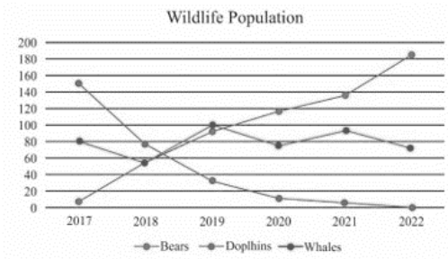
1. Graphs with lines
We will utilize the line that connects the points or portions of the various data in the graph by taking two variables on the horizontal and vertical axes in the linear diagrammatic representations of the data.
Example: The diagram below shows a linear representation of the bear, whale, and dolphin population.
2. Bar Charts
The data can be represented by rectangular bars in the bar diagrammatic representation of data. The height of the bars represents the variable’s value or frequency. The width of all rectangular bars should be the same. This is one of the most widely used tools for data comparison.
Example: Birthdays of several pupils in the school during various months.

3. The histogram
Histograms are similar to bar graphs in that they represent data with rectangular bars. However, there are no gaps between any of the rectangular bars.

4. Pie Charts
A pie diagram is a diagram that uses circles and spheres to display data. A circle is divided into pieces in a pie diagram, with each part representing the proportion of various data.
Example: The pie chart below depicts the various forms of transportation used by the pupils.

5. Pictographs
The pictographic representation uses images or symbols to graphically depict the data. In pictographic diagrams, the symbol or image represents the frequency of the object in the supplied set of data. Pictographs used symbols or images to convey information about the data.
Example: Each image indicates the value, and the pictograph diagram below displays the method of transportation used by the number of pupils utilising the image.

Conclusion
We looked at the definitions of diagrammatic representations of data in this post. We also looked at the benefits and fundamentals of diagrammatic representations. The sorts of diagrammatic representations utilised, as well as the constructions, are described in this article. This article looked at some solved instances that can help us comprehend and build diagrammatic representations more easily.
