Data interpretation refers to the process of using diverse analytical methods to make sense of a collection of data that has been processed. The collected data may be present in various forms like bar graphs, line charts, histograms, pie charts, tabular forms, etc. Hence, it needs to be interpreted to summarise the information. The methods of data interpretation are designed to help people analyse and make sense of numerical data. The interpretation of data is subjective, and it varies from business to business.
Methods of Data Interpretation
There are two methods to interpret the data:
1. Qualitative method
This method is used to analyse qualitative data or categorical data. The qualitative data interpretation used texts instead of numbers or patterns to represent the data. Nominal and ordinal data are the two types of qualitative data. Ordinal data interpretation is much easier than nominal data interpretation.
2. Quantitative method
This method is used to analyse quantitative data or numerical data. Quantitative data interpretation uses numbers instead of texts to represent the data. The types of quantitative data interpretation are discrete and continuous data. The quantitative method of data interpretation requires statistical methods and techniques like mean, median, standard deviation, etc.
Pie Chart
A pie chart or a pie diagram displays the comparison among the contribution of different components and their contribution in relation to the whole. In a pie diagram, an entire circle representing the entire data set is divided into different sectors.
The contribution of each category, represented by the sectors, is separated by the radii of the circle. The areas of each sector are proportional to their respective angles at the centre. These are again proportional to the contributions of various components in relation to the aggregate.
In order to construct a pie diagram, the proportion of values in each category is expressed in terms of percentages first. As a circle has a total of 360° at its centre, the total values are represented by 360°. The angles corresponding to different categories are calculated proportionately.
Therefore, for a category having f values out of a total of N, the percentage contained would be:
p = (f/N) x 100
The angle contribution of the corresponding category would be:
= P/100 x 360
= 3.6 p degrees
A circle is then drawn and divided into various segments with the angles at its centre.
Example
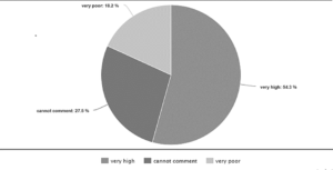
A sample of 280 undergraduate students was asked to give their opinion regarding the chance of India’s win in the world cup cricket championship in 2011 prior to the game. Each student was to respond either to “very high,” “very poor,” or “cannot comment” on the issue. The following data were obtained:
|
Responses |
Number of students |
|
Very high |
152 |
|
Cannot comment |
77 |
|
Very poor |
51 |
Draw a pie chart for the given data.
Solution
|
Responses |
Number of students |
Percentage of students |
Angle size in degrees |
|
very high |
152 |
(152/280) x 100 = 54.3 |
3.6 x 54.3 = 195o |
|
cannot comment |
77 |
(77/280) x 100 = 27.5 |
3.6 x 27.5 = 99o |
|
very poor |
51 |
(51/280) x 100 = 18.2 |
3.6 x 18.2 = 66o |
Bar Graph
Multiple Bar Diagram
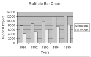
A multiple bar diagram is used to compare data on two or more variables (qualitative or quantitative), such as the production of paddy or tea in the last ten years. In this diagram, joint multiple bars are drawn to represent data on two or more variables at a time corresponding to the same time point or category.
Example
Construct a multiple bar chart representing the imports and exports of a country.
|
Years |
Imports |
Exports |
|
1991 |
6930 |
3260 |
|
1992 |
7850 |
4225 |
|
1993 |
8780 |
5150 |
|
1994 |
10720 |
6340 |
|
1995 |
11150 |
7145 |
Solution
Divided Bar Diagram
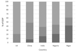
Another way of representing data is using a divided bar diagram. This diagram shows how the total values are distributed over different categories. Here, a single bar is taken to represent an entire set.
Example
Create a divided bar graph to show the GDP growth of the following countries.
|
Country Name |
Primary |
Secondary |
Tertiary |
|
UK |
0.7 |
20.2 |
79.2 |
|
China |
7.9 |
40.5 |
51.6 |
|
India |
15.4 |
23 |
61.5 |
|
Nigeria |
21.1 |
22.5 |
56.4 |
|
Niger |
41.6 |
19.5 |
38.7 |
Solution
Benefits of Data Interpretation
-
Data interpretation mostly helps in decision making
-
It helps in predicting upcoming trends and future competition
-
Data interpretation also helps you gain knowledge to achieve a competitive strategy
Conclusion
Data interpretation is the process of understanding, organising, and interpreting the given data to make sense of and get a meaningful conclusion. The basic concept of data interpretation is to review the collected data by means of analytical methods and arrive at relevant conclusions.
There are two methods to interpret data: quantitative method and qualitative method. Two major types of data interpretation include bar graphs and pie charts.
 Profile
 Settings
 Refer your friends
 Sign out


