Diagrammatic representation of the data section provides a high-level overview of the data in a report. It provides a context for the data and helps the reader understand how it was analysed. This section also includes any relevant background information to help the reader understand the data presented in the rest of the report.
Basic analysis of the diagrammatic representation of data
This presentation uses a diagrammatic representation to illustrate the data analysis. It includes information about the number of visitors to the website, the pages they visited, and the search terms they used to find the website. It also provides information about the number of visitors to the website on each day of the week and the time of day they searched. It gives insights into the number of visitors on different days of the week and at other times of the day.
- Numeric information shows through cartograms, pictograms, pie diagrams, and bar diagrams. It is the foremost participant thanks to mean applied mathematics information. Charts facilitate visual comparison.
- Cartograms are diagrammatic representations via maps and graphs to indicate the geographical distribution of specific things.
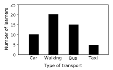
- Bar diagrams present an identical base. Their peaks outline the volume/importance of the variable. The dimension of all the bars and the intervals between the 2 bars are similar.
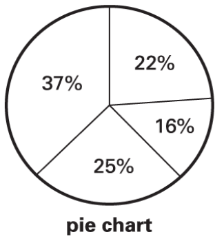
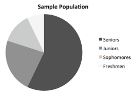
- A pie diagram is a sectioned circle to indicate the proportion of numerous parts of the information.
- Out of the contributed diagrams, only one-dimensional bar graphs and pie charts are in our scope.
Diagrammatic representation of data: Understand a few points
Data visualisation through charts
It shows how the gender wage gap affects earnings across a worker’s lifetime. Each year represents a year of work experience, with the x-axis representing years since graduation.
The y-axis represents monthly earnings, with each point representing the average earnings of men and women in that position. The bubble size means the designated year of experience earnings, with larger bubbles representing higher earnings.
There are numerous ways to present data, from tables and charts to movies and photo galleries. Regardless of the method chosen, it is essential to ensure that it is clear and concise.
In this guided practice, you will learn the basics of diagrammatic data presentation and practice creating a basic data table and chart. This intro to data visualisation will help you get comfortable with the essential data visualisation elements, such as the data table and graph.
Presentation of data clearly and compellingly using graphs, charts, and data tables.
Some sample pie charts are given below –


Data table
A data table is a list of values organised horizontally (or in columns) and vertically (or in rows) to present data in a tabular format.
Each cell in the table represents a single observation or measurement of a variable. The table is often displayed with too large data for a single graph. The table can also visualise multiple variables at the same time.
If you are new to data visualisation, the best way to get started is to look at examples. An example of a data table is given below –
Sl. No. | Name | Marks | Grade |
1. | Rishi | 99 | A+ |
2. | Suraj | 85 | A |
3. | Ravi | 64 | C |
4. | Harsh | 79 | B |
One of the best ways to understand the basics of data visualisation is to look at real-world examples. This section provides a guided practice to create a data table and chart.
The guided practice will teach you the basics of data diagrammatic presentation, including the data table and chart.
Understanding the elements of an exemplary data diagram is an essential part of becoming a great data visualiser.
This section will introduce the essential elements of a data table and chart and provide several examples of each. Finally, it will give a guided practice where you can create your data diagrams.
Different types to present data
There are various ways to present data clearly and compellingly using graphs, charts and data tables.
One of the most basic forms of data visualisation is the data table, which organises data into rows and columns. Each cell in the table contains the same type of information, such as a column for the year of graduation, monthly earnings, and gender.
The table allows the reader to identify critical aspects of the data, such as the gender wage gap, make simple comparisons and extract trends.
One of the most common ways to present data is through a graph, chart, or table. Each of these three elements has a unique purpose and set of advantages and disadvantages.
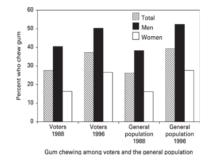
Some examples of representing data by graph is given below –


This section will provide a basic introduction to each of these data presentation tools to help you understand when to use each one and some tips for effective diagrammatic data presentation. The section will also provide examples of effective diagrammatic data presentation from the report.
Different types of data
Data is a vital resource. It can inform decisions, predict future outcomes and solve problems. But where does data come from? We can present data in different ways. Data in economics refers to the information about the world used by economists to make their arguments and test their hypotheses. This section will discuss these different types of data, focusing on their use in diagramming and modelling in economics.
The world of economics comprises two main types of data: nominal data and accurate data. Nominal data refers to the data that measures the values of things like income, production and interest rates. For example, nominal GDP is the most common measure of the economy’s progress. The economy adds up all the goods and services produced, and the nominal GDP is the total value of that production.
It can also include information obtained through experimentation, such as how people respond to different types of treatments. Data can be used to answer questions in various fields, such as the economics of education, the economics of crime, and the economics of the environment.
Data comes in many different forms, such as numbers and charts, and are used to describe the economy’s past, present, and future. Data can be either qualitative or quantitative.
Conclusion
Diagrammatic Presentation of Data is the most valuable resource in the modern student world. It is the fuel that runs our economies and the foundation of our student’s scientific knowledge.
The ability to extract knowledge from data has enabled us to solve some of the most complex problems imaginable. However, the volume of data has become so great that it is difficult to manage and impossible to comprehend.
Data is the “stuff” of computing. It provides the raw material for the programs and systems we build. Without Diagrammatic Presentation of Data, we wouldn’t have anything to build on for students.
 Profile
 Settings
 Refer your friends
 Sign out


