Access free live classes and tests on the app
Download
+
Unacademy
  • Goals
    • AFCAT
    • AP EAMCET
    • Bank Exam
    • BPSC
    • CA Foundation
    • CAPF
    • CAT
    • CBSE Class 11
    • CBSE Class 12
    • CDS
    • CLAT
    • CSIR UGC
    • GATE
    • IIT JAM
    • JEE
    • Karnataka CET
    • Karnataka PSC
    • Kerala PSC
    • MHT CET
    • MPPSC
    • NDA
    • NEET PG
    • NEET UG
    • NTA UGC
    • Railway Exam
    • SSC
    • TS EAMCET
    • UPSC
    • WBPSC
    • CFA
Login Join for Free
avtar
  • ProfileProfile
  • Settings Settings
  • Refer your friendsRefer your friends
  • Sign outSign out
  • Terms & conditions
  • •
  • Privacy policy
  • About
  • •
  • Careers
  • •
  • Blog

© 2023 Sorting Hat Technologies Pvt Ltd

  • CAT 2023
  • Study Materials
  • Notifications
  • CAT Syllabus
  • CAT Mock Test
  • CAT Exam Pattern
  • CAT Question Paper
  • CAT Preparation Books
  • Downloads
  • Important Formulas
  • Eligibility Criteria
CAT 2025 » CAT Study Material » Data Interpretation and Logical Reasoning » Pie Graph Categories
scholarship_cat

Pie Graph Categories

All About Pie Graph Categories, how to interpret pie charts, types of pie charts, pie chart questions.

Table of Content
  •  

A pie chart is a visual representation of data in the shape of a circular chart or pie, with the slices indicating the magnitude of the data. To represent data in the shape of a pie chart, you’ll need a list of numerical and categorical variables. Each slice’s arc length, and hence its area and centre angle in a pie chart, is proportionate to the quantity it depicts.

Definition of Pie Chart

A pie chart is a type of graph that records data in a circular shape and divides it into sectors to represent data from a single component of the whole. Each of these sectors or slices represents a proportionate component of the whole. Pie charts, often known as pie diagrams, help with data interpretation and display. It can be used to compare data as well.

 Types of Pie Charts

Pie charts are classified into two types based on the graph’s dimension: a 2D pie chart and a 3D pie chart.

2D Pie Chart

A circular graph depicting the percentage of variables in a dataset is known as a two-dimensional pie chart. This type of pie chart displays the items in two dimensions. The 2D pie chart is classified into four types based on how the variables are visualised on the pie chart:

  1. Simple Pie Chart
  2. Exploded Pie Chart
  3. Pie of Pie
  4. Bar of Pie

3D Pie Chart

A three-dimensional version of a pie chart is known as a 3D pie chart. It’s mostly for show, and it has nothing to do with how data is displayed in a pie chart. Instead, it distorts the graph and makes it harder to understand. The three-dimensional pie chart is split into two sections:

  1. A simple 3D chart
  2. exploded 3D chart

Interpret the key Results for Pie Chart

To compare the proportion of data in each category, use a pie chart. A pie chart is a circle (the pie) cut into slices (the slices) to depict the proportion of observations in each category.

To interpret a pie chart, compare groups.

  • When evaluating a pie chart, look for differences in the size of the slices. The size of a slice represents the proportion of observations in each group.
  • When comparing many pie charts, check for differences in slice size for the same categories across all of them.

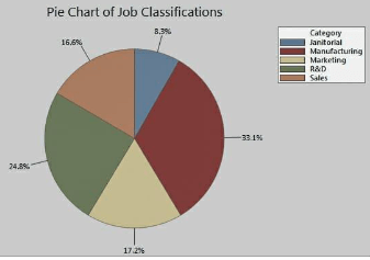
The proportions of job classifications at a corporation are depicted in the pie chart below. Manufacturing takes up the most space. Sales and marketing positions are roughly equal in number. The janitorial portion is the smallest.

Directions: Examine the pie chart below and respond to the questions that follow

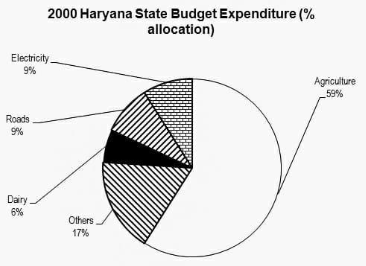
Example 1: In the centre angle of the sector for agriculture expenditure, how many degrees should there be?

  1. 220
  2. 213
  3. 210
  4. 208

In a pie chart, 100 percent is distributed over 360 degrees. As a result, 1 percent equals 3.6°. Agriculture spending accounts for 59% of total spending. As a result, 3.6 59 = 212.4°. The solution is (2)

Example 2: What is the approximate ratio of agricultural to dairy expenditures?

  1. 8:3
  2. 9:2
  3. 70:1
  4. 10:1

Sol: One common blunder here is that students calculate the actual agricultural and dairy values. Because budget spending is proportional to the area covered, the ratio of agriculture to dairy spending would be the ratio of matching percent allocations. Agriculture/Dairy = 59/6 = 10/1 as a result. The solution is (4).

Example 3: In Haryana, a total of Rs. 120 million was spent in 2000. What was the amount of money spent on roads by the Haryana government?

  1. 15.4
  2. 20
  3. 10.8
  4. 12

Solved: Total spending = 100% = Rs. 120 mn.. Road expenditure = 9% = 9/100 x 120 = Rs. 10.8 mn. As a result, the answer is 3rdoption.

Example 4: If Rs. 9 mn was spent on dairy in 2000, what was the total expenditure in million?

  1. 150
  2. 140
  3. 160
  4. 130

Sol: Dairy took 9 mn. In the year 2000, this sum accounted for 6% of total expenditure.

6 = (Dairy Spending/Total Spending) / 100

100 = 6 = (9/Total Expenditure)

Total Exp = Rs. 150 million (9/6) Hence, Option 1 is the correct answer.

Example 5: In 1999, Haryana spent 11% of its total expenditures on roads. “Did Haryana spend more money on roads in 1999 than it did in 2000?” says the question.

  1. No other information is required.
  2. The entire amount spent in each year must be known.
  3. In 1999, the exact percent age breakdown of the various costs is required.
  4. Make dairy spending mandatory in both years.

Sol: percent only provides a proportional representation of total quantity.

Percentage of total expenditure is meaningless unless complete expenditure is known.

As a result, in order to compare road spending in 1999 and 2000, the total amount spent must be known.

The solution is (2).

Conclusion

Finally, after reading this post, you should be able to make a pie chart in both Excel and EdrawMax. A pie chart is a visual representation of data that can be used in a variety of situations.

faq

Frequently asked questions

Get answers to the most common queries related to the CAT Examination Preparation.

How do you solve a pie chart question?

Ans. To calculate the total number of data points in a pie chart slice, multiply the slice percentage by the total n...Read full

What is a pie chart used for example?

Ans. In business, pie charts are frequently utilised. Showing percentages of different types of clients, percentages...Read full

How should a pie chart be read?

Ans. Look for differences in the size of the slices while you’re interpreting a pie chart. The proportion of o...Read full

In a pie chart, what is a 1/3?

Ans. The 1 in your fraction denotes the fraction’s percentage of the entire (the 3). Your fraction signifies &...Read full

When should you use a pie graph?

Ans. When trying to figure out how something is made, a pie chart is the ideal tool. A pie chart would be ideal for ...Read full

Ans. To calculate the total number of data points in a pie chart slice, multiply the slice percentage by the total number of data points and divide by 100. A slice of the pie chart, for example, is 60 percent of the overall data set, and the pie chart has 150 data points.

Ans. In business, pie charts are frequently utilised. Showing percentages of different types of clients, percentages of income from different goods, and earnings from different nations are just a few examples. When there are a few levels, pie charts can be useful for displaying the link between the parts and the whole.

Ans. Look for differences in the size of the slices while you’re interpreting a pie chart. The proportion of observations in each group is shown by the size of a slice. Look for variances in the size of slices for the same categories across numerous pie charts when comparing them.

Ans. The 1 in your fraction denotes the fraction’s percentage of the entire (the 3). Your fraction signifies “1 part of 3 total parts” because your numerator is a one. If the graph above were a pie, you could say that 1/3 of it has been consumed.

Ans. When trying to figure out how something is made, a pie chart is the ideal tool. A pie chart would be ideal for categorical data because each slice can represent a distinct category. Below is an illustration of a pie chart.

Crack CAT with Unacademy

Get subscription and access unlimited live and recorded courses from India’s best educators

  • Structured syllabus
  • Daily live classes
  • Ask doubts
  • Tests & practice
Learn more

Notifications

Get all the important information related to the CAT Exam including the process of application, important calendar dates, eligibility criteria, exam centers etc.

CAT Eligibility Criteria 2023
CAT Exam Pattern 2023
CAT Result 2022
CAT Syllabus 2023 – CAT Exam Syllabus – Download Latest PDF
IBSAT 2022 Notification
IIFT Notification
MAH CET Notification
MICAT Notification
NMAT Notification
SNAP Notification
TISSNET Notification
Top Colleges in India That Accept CAT Score
XAT Notification
See all

Related articles

Learn more topics related to Data Interpretation and Logical Reasoning
Wilson Remainder Theorem

To reduce huge numbers with regard to a certain modulus and to solve congruences, Wilson's theorem and Fermat's theorem can be employed.

Why Use the Critical Path Method

A brief note on Why use the critical path method, Improves future planning, Facilitates more effective resource management, Helps avoid bottlenecks and many things.

What is Types of Analogy Reasoning

In this lecture we’re going to learn about types of analogy reasoning, the number based/numerical analogy, letter and number based analogy and general knowledge-based analogy, questions based on analogy and many more things.

What is Posterior Probability

A posterior probability, in Bayesian records, is the revised or updated probability of an event happening after taking into account new records. The posterior probability is calculated by updating the prior probability by using Bayes’ theorem. In statistical phrases, the posterior probability is the probability of event A taking place given that event B has taken place.

See all
Access more than

469+ courses for CAT – Optional

Get subscription

Trending Topics

  • CAT Mock Test
  • CAT Question Papers
  • CAT 2021 Question Paper
  • CAT 2020 Question Paper
  • CAT Question Paper 2019 PDF
  • Best Books for CAT Preparation
  • CAT Eligibility Criteria
  • CAT Syllabus
  • CAT Exam Pattern
  • CAT Result
combat_cat

Related links

  • Co-ordinate Geometry applications
  • What Is A Polygon?
  • Uses of a Quadrilateral
  • Algebraic Identities
  • SPSS Full Form
  • Geometric Progression’s Uses
  • Blood Relation Questions
freeliveclasses_cat
CAT 2024 Question Paper
.
Company Logo

Unacademy is India’s largest online learning platform. Download our apps to start learning


Starting your preparation?

Call us and we will answer all your questions about learning on Unacademy

Call +91 8585858585

Company
About usShikshodayaCareers
we're hiring
BlogsPrivacy PolicyTerms and Conditions
Help & support
User GuidelinesSite MapRefund PolicyTakedown PolicyGrievance Redressal
Products
Learner appLearner appEducator appEducator appParent appParent app
Popular goals
IIT JEEUPSCSSCCSIR UGC NETNEET UG
Trending exams
GATECATCANTA UGC NETBank Exams
Study material
UPSC Study MaterialNEET UG Study MaterialCA Foundation Study MaterialJEE Study MaterialSSC Study Material

© 2025 Sorting Hat Technologies Pvt Ltd

Unacademy
  • Goals
    • AFCAT
    • AP EAMCET
    • Bank Exam
    • BPSC
    • CA Foundation
    • CAPF
    • CAT
    • CBSE Class 11
    • CBSE Class 12
    • CDS
    • CLAT
    • CSIR UGC
    • GATE
    • IIT JAM
    • JEE
    • Karnataka CET
    • Karnataka PSC
    • Kerala PSC
    • MHT CET
    • MPPSC
    • NDA
    • NEET PG
    • NEET UG
    • NTA UGC
    • Railway Exam
    • SSC
    • TS EAMCET
    • UPSC
    • WBPSC
    • CFA

Share via

COPY