Access free live classes and tests on the app
Download
+
Unacademy
  • Goals
    • AFCAT
    • AP EAMCET
    • Bank Exam
    • BPSC
    • CA Foundation
    • CAPF
    • CAT
    • CBSE Class 11
    • CBSE Class 12
    • CDS
    • CLAT
    • CSIR UGC
    • GATE
    • IIT JAM
    • JEE
    • Karnataka CET
    • Karnataka PSC
    • Kerala PSC
    • MHT CET
    • MPPSC
    • NDA
    • NEET PG
    • NEET UG
    • NTA UGC
    • Railway Exam
    • SSC
    • TS EAMCET
    • UPSC
    • WBPSC
    • CFA
Login Join for Free
avtar
  • ProfileProfile
  • Settings Settings
  • Refer your friendsRefer your friends
  • Sign outSign out
  • Terms & conditions
  • •
  • Privacy policy
  • About
  • •
  • Careers
  • •
  • Blog

© 2023 Sorting Hat Technologies Pvt Ltd

  • CAT 2023
  • Study Materials
  • Notifications
  • CAT Syllabus
  • CAT Mock Test
  • CAT Exam Pattern
  • CAT Question Paper
  • CAT Preparation Books
  • Downloads
  • Important Formulas
  • Eligibility Criteria
CAT 2025 » CAT Study Material » Data Interpretation and Logical Reasoning » Know About Solving a Line Graph
scholarship_cat

Know About Solving a Line Graph

Everything You Should Know About Solving A Line Graph, solving a line graph, line charts basics, line graphs for cat data interpretation

Table of Content
  •  

A line graph, also known as a line plot or a line chart, is a graph in which individual data points are connected by lines. A line graph shows quantitative values over a set period of time. Line charts are often used in finance to illustrate the price action of an asset or security over time.

Definition of Line Graph

A line graph is a sort of graph or chart that displays data that varies over time. A line graph is created by connecting numerous points using straight lines.

Basics of Line Graphs

The most efficient way to create a line chart is to:

The line chart has a vertical y-axis and a level x-axis. Line diagrams are drawn with the goal of placing dependent data on the vertical y-axis and autonomous data on the horizontal x-axis (e.g. time). Because the majority of line diagrams only deal with positive numbers, these axes frequently cross near the y-axis’ base and the x-axis’ left end. When the axes cross, it is more likely than not (0, 0). Each axis is labelled with a different information type. Days, quarters, weeks, or years, for example, could be on the x-axis, while income, generation, consumption, cost in rupees, and so on could be on the y-axis.

Line charts are useful because they clearly show information factors and patterns. Line diagrams can help people anticipate the ramifications of information that hasn’t been captured yet. The most capable visual gadget for fund, showcasing, and diverse zones is this type of chart. It can also be used for climate monitoring, laboratory research, or any other task that requires a relationship between two numerical data. If the diagram contains more than one line, it can be used to do a comparison between them. Line diagrams are only useful for contrasting these informational collections if the axes have identical scales.

Line Graph – Data Interpretation for CAT

Data interpretation, as the name implies, is all about logically interpreting data and answering questions. In the third section of the CAT, data interpretation is given the same weight as reading comprehension or geometry and algebra in the verbal section. CAT has had roughly 20 questions on data interpretation for the past two years (CAT 2014 & CAT 2015). If you haven’t taken this topic seriously yet, there is no better time than now to begin!

Tables, bar graphs, line graphs, paragraphs, and pie charts are just a few examples of how data can be represented. This post will focus on LINE GRAPHS and will teach you the fundamentals of a line graph.

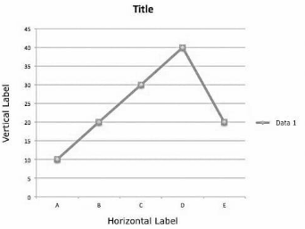
The following is a basic example of a line graph, with its numerous components:

The graph’s title informs us about what the graph is about.

Horizontal and vertical labels inform us about the data type.

Axis: The X and Y axes indicate the data’s unit.

Dots: The dots on the line graph represent a combination of data on the X and Y axes.

Line: In the graph above, the blue line connecting the dots represents the data and its variation visually.

Examine the graph below for its various components

The graph is titled “Number of students at TathaGat centre.”

Label: “Time” is represented horizontally, and “Number of students” is represented vertically.

Axis: The X axis depicts time in hours, while the Y axis depicts an absolute number.

Dots: Dots reflect the number of boys at TathaGat at any given time. At 12 o’clock, there were 50 lads at TathaGat centre.

Line: That  line for boys depicts how the number of pupils rises from 12:00 to 13:00’o clock, drops to 40 at 14:00’o clock, and then rises again until 16:00’o clock.

We may clearly deduce from the above graphic representation that as the line rises, the number of students rises, and as it falls, the number of students reduces. However, the above blue line can also tell us the rate of this increment or decrement, or in other words, the data’s growth (positive or negative).

The slope of the line is directly proportional to the rate of increase or decrease. The steepness or inclination of the line is referred to as slope. Growth is related to the steepness of the line that is being followed. A thicker line indicates faster growth. So far, we’ve seen line graphs with only one variable or data; here’s an example of a line graph with two variables.

Examine the graph and its various components carefully and respond to the following question

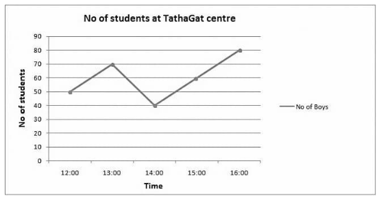
Q1. At what time the number of boys was highest at the centre?

Solution 1: Based on the graph, it is clear that the number of boys was highest at 16:00 o’clock.

Q2. At what time the total number of students was lowest at the centre?

Solution 2: To determine the answer to this issue, add  the number of boys and girls at various hours.

At 12:00 o’clock total number of students = 90

At 13:00 o’clock total number of students = 130

At 14:00 o’clock total number of students = 110

At 15:00 o’clock total number of students = 110

So the answer is that the number of pupils was highest around 13:00 o’clock.

Q3. During what period the rate of growth of the numbers of girls were highest?

Solution 3: Looking at the graph, we can see that the red line is steepest between 12:00 and 13:00, indicating that this is when the number of girls is growing the fastest.

We may check it using the following formula:

Between 12:00 and 13:00, 13:00 and 14:00, 14:00 and 15:00, and 15:00 and 1600, the growth rate is 50 percent, 16.66 percent, – 28.56 percent, and -40 percent, respectively.

Conclusion

The main purpose of a line graph is to track changes over time, both short and long. It’s also utilised to compare changes in different groups during the same time period.

faq

Frequently asked questions

Get answers to the most common queries related to the CAT Examination Preparation.

In a line graph, what is a data point?

Ans. A data point is the point on the line graph where a time on the x-axis intersects with a data value on the y-ax...Read full

What is a Straight Line Graph?

Ans. A two-variable linear graph is known as a straight-line graph. y = mx + c is the general form, where ‘x&#...Read full

What is a double-line graph?

Ans. It’s a line graph that represents two sets of data on a single graph. It is commonly used to compare resu...Read full

In a line graph, how many lines may there be?

Ans. A line graph might have multiple lines since it makes it easier to compare data. To avoid misunderstandings and...Read full

In Word, how do you describe a line graph?

Ans. A line graph shows data through time in a single line. Follow the graph’s journey along the horizontal ax...Read full

Ans. A data point is the point on the line graph where a time on the x-axis intersects with a data value on the y-axis. In a line graph, the data points are represented by little circles or dots. To assess the growth tendency, they are connected by line segments.

Ans. A two-variable linear graph is known as a straight-line graph. y = mx + c is the general form, where ‘x’ and ‘y’ are the variables,’m’ is the slope of the graph, and ‘c’ is the value of ‘y’ at x = 0.

Ans. It’s a line graph that represents two sets of data on a single graph. It is commonly used to compare results, information, or events. To ensure data clarity, the lines are usually denoted by distinct colours.

Ans. A line graph might have multiple lines since it makes it easier to compare data. To avoid misunderstandings and errors in interpretation, contrasting colours should be used. Avoid employing more than 4-5 lines at once since the lines will become a tangle and you will have difficulty comprehending them.

Ans. A line graph shows data through time in a single line. Follow the graph’s journey along the horizontal axis and describe whether it moves down, up, or stays the same to describe it.

Crack CAT with Unacademy

Get subscription and access unlimited live and recorded courses from India’s best educators

  • Structured syllabus
  • Daily live classes
  • Ask doubts
  • Tests & practice
Learn more

Notifications

Get all the important information related to the CAT Exam including the process of application, important calendar dates, eligibility criteria, exam centers etc.

CAT Eligibility Criteria 2023
CAT Exam Pattern 2023
CAT Result 2022
CAT Syllabus 2023 – CAT Exam Syllabus – Download Latest PDF
IBSAT 2022 Notification
IIFT Notification
MAH CET Notification
MICAT Notification
NMAT Notification
SNAP Notification
TISSNET Notification
Top Colleges in India That Accept CAT Score
XAT Notification
See all

Related articles

Learn more topics related to Data Interpretation and Logical Reasoning
Wilson Remainder Theorem

To reduce huge numbers with regard to a certain modulus and to solve congruences, Wilson's theorem and Fermat's theorem can be employed.

Why Use the Critical Path Method

A brief note on Why use the critical path method, Improves future planning, Facilitates more effective resource management, Helps avoid bottlenecks and many things.

What is Types of Analogy Reasoning

In this lecture we’re going to learn about types of analogy reasoning, the number based/numerical analogy, letter and number based analogy and general knowledge-based analogy, questions based on analogy and many more things.

What is Posterior Probability

A posterior probability, in Bayesian records, is the revised or updated probability of an event happening after taking into account new records. The posterior probability is calculated by updating the prior probability by using Bayes’ theorem. In statistical phrases, the posterior probability is the probability of event A taking place given that event B has taken place.

See all
Access more than

469+ courses for CAT – Optional

Get subscription

Trending Topics

  • CAT Mock Test
  • CAT Question Papers
  • CAT 2021 Question Paper
  • CAT 2020 Question Paper
  • CAT Question Paper 2019 PDF
  • Best Books for CAT Preparation
  • CAT Eligibility Criteria
  • CAT Syllabus
  • CAT Exam Pattern
  • CAT Result
combat_cat

Related links

  • Co-ordinate Geometry applications
  • What Is A Polygon?
  • Uses of a Quadrilateral
  • Algebraic Identities
  • SPSS Full Form
  • Geometric Progression’s Uses
  • Blood Relation Questions
freeliveclasses_cat
CAT 2024 Question Paper
.
Company Logo

Unacademy is India’s largest online learning platform. Download our apps to start learning


Starting your preparation?

Call us and we will answer all your questions about learning on Unacademy

Call +91 8585858585

Company
About usShikshodayaCareers
we're hiring
BlogsPrivacy PolicyTerms and Conditions
Help & support
User GuidelinesSite MapRefund PolicyTakedown PolicyGrievance Redressal
Products
Learner appLearner appEducator appEducator appParent appParent app
Popular goals
IIT JEEUPSCSSCCSIR UGC NETNEET UG
Trending exams
GATECATCANTA UGC NETBank Exams
Study material
UPSC Study MaterialNEET UG Study MaterialCA Foundation Study MaterialJEE Study MaterialSSC Study Material

© 2025 Sorting Hat Technologies Pvt Ltd

Unacademy
  • Goals
    • AFCAT
    • AP EAMCET
    • Bank Exam
    • BPSC
    • CA Foundation
    • CAPF
    • CAT
    • CBSE Class 11
    • CBSE Class 12
    • CDS
    • CLAT
    • CSIR UGC
    • GATE
    • IIT JAM
    • JEE
    • Karnataka CET
    • Karnataka PSC
    • Kerala PSC
    • MHT CET
    • MPPSC
    • NDA
    • NEET PG
    • NEET UG
    • NTA UGC
    • Railway Exam
    • SSC
    • TS EAMCET
    • UPSC
    • WBPSC
    • CFA

Share via

COPY