A pie chart is a type of graph that represents the data in the circular graph. The slices of pie show the relative size of the data, and it is a type of pictorial representation of data. A pie chart requires a list of categorical variables and numerical variables. Here, the term “pie” represents the whole, and the “slices” represent the parts of the whole.
A pie chart shows how a total amount is divided between levels of a categorical variable as a circle divided into radial slices. Each categorical value corresponds with a single slice of the circle, and the size of each slice (both in area and arc length) indicates what proportion of the whole each category level takes.
Whenever some data has to be represented visually as a fractional part of a whole, we use pie charts. It is used to compare the data and see why one is smaller/greater than the other. Therefore, when we are dealing with a limited number of buckets and discrete data sets, it’s better to use a pie chart. Listed below are a few uses of a pie chart:
In a business, it is used to compare the growth areas such as profit and loss.
In school, pie charts are used to show the time allotted to each section, the grades of students in a form of percentages, etc.
Pie charts are used in comparing the relative size of data of people owning the same vehicles, similar houses, etc.
They are used to represent the marketing and sales data for the comparison of brands.
We use the following steps to construct a pie chart and using the above-mentioned formulas, we can calculate the data.
Step 1: Write all the data into a table and add up all the values to get a total.
Step 2: To find the values in the form of a percentage divide each value by the total and multiply by 100.
Step 3: To find how many degrees for each pie sector we need, we take a full circle of 360° and use the formula: (Frequency/Total Frequency) × 360°
Step 4: Once all the degrees for creating a pie chart are calculated, draw a circle (pie chart) using the calculated measurements with the help of a protractor.
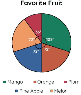
Example: Construct a pie chart to visually display the favorite fruits of the students in a class based on the given data: Mango – 45; Orange – 30; Plum – 15; Pineapple – 30; Melon – 30
Solution:
Step 1: Create a table with the values and get the total.
Mango | 45 |
Orange | 30 |
Plum | 15 |
Pineapple | 30 |
Melon | 30 |
Total | 150 |
Step 2: Find the percentage of each value:
Mango = (45/150) × 100 = 30%
Orange = (30/150) × 100 = 20%
Plum = (15/150) × 100 = 10%
Pineapple = (30/150) × 100 = 20%
Melon = (30/150) × 100 = 20%
Step 3: Finding the degree of each pie sector using the formula: (Given data/Total Value of data) × 360°
Category | Formula | Degree |
Mango | (45/150) × 360 | 108° |
Orange | (30/150) × 360 | 72° |
Plum | (15/150) × 360 | 36° |
Pineapple | (30/150) × 360 | 72° |
Melon | (30/150) × 360 | 72° |
Draw a pie chart using all of the aforementioned degrees and a protractor. As a result, the pie chart appears as follows:
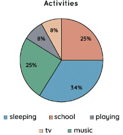
Example 1: The graph below depicts Diana’s activities over the course of a week.
a) Determine the centre angle occupied during sleeping.
b) Determine how much time Diana spends at school.
c) Determine the central angle of the game.
Solution:
a) Sleeping time is 34 percent of total time; (34/100) 360 = 122.4°. As a result, when sleeping, the centre angle is 122.4°.
b) School time equals 25% of total time; 25/100 = 1/4. As a result, she spends a quarter of her time at school.
c) Playing time = 8% of total time; (8/100) 360 = 28.8° As a result, the central angle at play was 28.8°.
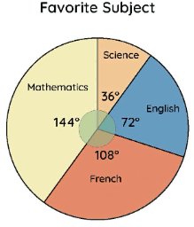
Example 2: The pie chart depicts the students’ preferred subjects in a class. Calculate the percentage of students who chose English using the data in the pie chart.
Solution:
Let’s start by looking at the pie chart to see what percentage of pupils choose English.
We know that 144° plus 36° plus 72° plus 108° equals 360°.
The following is the percentage of students who choose English: (72/360) 100 = 20.
As a result, the percentage of pupils who choose English equals 20%.
Example 3: A pie chart is divided into three pieces, each having an angle of x, 4x, and 5x. Find the degree value of x.
Solution:
We all know that the total of all angles on a pie chart equals 360o.
⇒ x + 4x + 5x = 360º
⇒ 10 x = 360º
⇒ x = 360º/10
⇒ x = 36º
As a result, x has a value of 36º.
Area charts are useful for displaying how a total and its shares have changed over time. Consider them a cross between a line chart and a column chart (change over time) (distributions and comparisons). Parts of a whole are displayed using pie charts. Use these to demonstrate how an entity is broken down into its constituent parts.
 Profile
 Settings
 Refer your friends
 Sign out