Profile
 Settings
 Refer your friends
 Sign out


Graphical reasoning is fundamentally synonymous with graphical reasoning. It entails analysing sequences of forms or symbols (graphics) in order to deduce the processes that led to a specific outcome.
Compared to tabular and textual forms of data, diagrammatic data representations facilitate a simple and straightforward comprehension of any numerical data acquired.
Graphical Reasoning
In numerical reasoning tests, graphs are used to convey complex facts, but they are frequently designed to appear complex while concealing the information you need to answer the question.
The most crucial component of learning to solve graph problems is understanding how to ignore noise and discover the quickest path to the information required to verify the result.
Line Graph
This is the most basic and prevalent sort of graph. Typically, it displays data along two axes, horizontal and vertical. Each element on the horizontal axis is represented by a value on the vertical axis. Typically, line graphs are employed to depict changes in a single variable across time.
The graph is comprised of the following elements
Heading -The title of the graph is the heading (duh). In most cases, will reflect the axis. In our case: the prevalence of mental diseases each year (vertical axis) (horizontal axis).
The vertical axis -This is the data that the graph is supposed to illustrate. In this instance, the issue is the prevalence of mental diseases.
Horizontal axis — this is the foundation of comparison for the graph (in 95 percent of cases, it will be time). Generally speaking, it displays the continuum over which the data varies. In our situation, it is years.
Labels – the names of the axes. These are not always there, thus you must determine the significance of the axes based on the header or context.
Legend – occurs when there are multiple lines on the same graph.
Bar Graph
A bar graph displays data by category using bars proportional to each category’s value. In contrast to a line graph, which incorporates a continuum (such as time), the categories in a bar graph are distinct.
A bar graph can be horizontal or vertical. Naturally, the vertical and category axes will switch positions.
Stacked Bar Graph
A stacked bar graph is identical to a bar graph, with the exception that multiple data components are displayed on the same bar. These graphs are excellent for displaying graphically and distinctions between categories or over time.
Pie Chart
The purpose of pie charts is to display proportions of various items. These factors may be measured in percentage, monetary value, numerical value (1,2,3,…), or any other unit.
The pie chart is one of the simplest diagrams, typically consisting of only three components:
- Heading
- Legend – indicates the colour distribution on the graph
- The entire amount shown by the pie chart.
Area Graph
Area diagrams may appear frightening at first look, yet they combine the characteristics of line graphs and stacked bar graphs. Each segment of colour indicates a set of data. Similar to bar graphs, area graphs may be two-dimensional or three-dimensional, vertical or horizontal.
Two types of area graphs exist: stacked and unstacked
In a non-stacked graph, each segment representing a data series supersedes portions of another data series.
Each segment in a stacked graph stands alone, and there is no overlap between series.
Graphical Reasoning Questions
1.Which of the following years had the lowest proportion of rejected applicants?
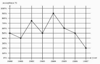
A. 2000
B. 2004
C. 2007
D. Insufficient data
Answer and explanation
B is the correct response.
The figure depicts supplementary data to the requested data, which is the percentage of students admitted to college.
2004 is the year with the lowest percentage of persons who were NOT accepted and the highest percentage of those who were accepted, according to the data.
2. Rich families spend ___________ of money on food as poor and middle class families combined.
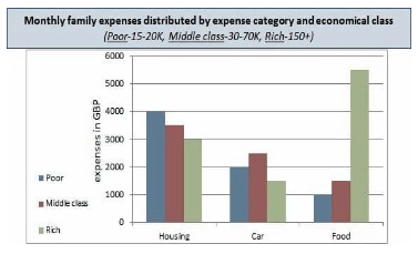
A. Greater than twice the quantity
B. An equal amount
C. Greater than threefold the quantity
D. Half the quantity
Answer and explanation
Rich households spend $5,500 per month on food, compared to $1,000 for poor families and £1,500 for middle-class families. Poor and middle-class families spend a total of £2,500 on food, which is less than half of what wealthy families spend. Rich households therefore spend more than twice (but less than three times) as much on food than poor and middle class families combined.
3. What is the percentage of clubs income from the total income?
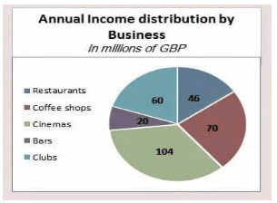
A. 10
B. 20
C. 60
D. Cannot Say
Answer and explanation
B is the correct response.
The data in the pie chart are expressed in millions of British pounds. To convert that to a percentage, we will first determine the total revenue of all businesses.
(60+20+104+46+70) = 300
Calculate the proportion of the club’s profits based on this amount:
(60/300) = 0.2 = 20 percent
Conclusion
Frequently, the graph served to confirm a solution (what we may have already derived algebraically). Regardless of whether graphs yield finite solutions, they provide a qualitative representation of functions and aid in the resolution of real-world issues.
Graphs have the benefit of revealing general tendencies in the quantitative behaviour of data, and hence have a predictive purpose.