Profile
 Settings
 Refer your friends
 Sign out


Bar graphs are visual representations of data (typically grouped) in the form of vertical or horizontal rectangular bars, the length of which is related to the data measure. Another name for them is bar charts. In the field of statistics, one method for the management of data is the usage of bar graphs. Statistics are the gathering, presentation, analysis, organisation, and interpretation of data observations. Tables, bar graphs, pie charts, histograms, frequency polygons, and other approaches can be used to illustrate statistical data.
Types of Bar Graph
Bar graphs are commonly used to compare multiple observations based on a single criterion (s). The bar graph is divided into six varieties based on the structure of the bars and the number of parameters.
- Horizontal bar graph
- Vertical bar graph
- Double bar graph (Grouped bar graph)
- Multiple bar graph (Grouped bar graph)
- Stacked bar graph
- Bar line graph
Horizontal Bar Graph
The bars travel horizontally along the x-axis up to the point of value proportional to the observation when the Y-axis represents the observation to be compared and the x-axis represents the magnitude of the observations. A horizontal bar graph is one that looks like this.
Vertical Bar Graph
Horizontal bar graphs are the polar opposite of vertical bar graphs. Horizontal bar graphs are preferable over vertical bar graphs.
The observation/category, which is usually a fixed variable, is represented by the x-axis. The numerical values carried by the observation are represented on the y-axis. The bars extend vertically along the y-axis from the x-axis to the point of value proportional to that particular observation.
Grouped Bar Graph
A grouped bar graph gives you the ability to compare many observations using multiple parameters. Grouped bar graphs can be divided into two forms based on the number of parameters utilised.
- Double bar graph
- Multiple bar graph
Double Bar Graph
A double bar graph allows you to compare two observations or categories using two parameters, as the name suggests. Those two metrics, on the other hand, should be measured in the same unit and in equivalent quantities.
Each observation is represented by two bars in a double bar graph. To emphasise the distinction, plot the two bars with two different and contrasting colours. You must also explain what each hue signifies on the graph.
Multiple Bar Graph
A multiple bar graph, as the name implies, allows you to compare numerous data using different parameters. You can specify as many parameters as you want, but each one must have the same measurement unit.
In a multiple bar graph, each observation has as many bars as there are parameters. If the grades of six students are compared in four topics, for example, four bars will be drawn for each student.
Stacked Bar Graph
A stacked bar graph combines multiple parameters into one graph. A stacked bar graph differs in that all of the parameters are represented by a single bar. So you may say that a single bar contains parts of a total.
A stacked bar graph has the potential to display a large amount of data in a concise and precise style. Stack bar graphs, on the other hand, are rarely used since they can be misleading at times and display too much data.
Bar Line Graph
A bar line graph combines the features of a bar and a line graph. It’s a grouped bar graph of some sort. This style of bar graph also allows you to compare observations based on several parameters. The distinction is that in this type, you can use the parameters of multiple units.
Bar Graph Examples with Questions
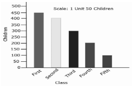
Example: 1) A bar graph depicts the number of children in each class from first to fifth. How about reading the bar graph and answering the questions?
(1) Which class has the most students in it?
(2) Which class has the smallest enrollment?
(3) How many students are in fourth grade?
- How many students are there in the first class?
Answers:
(1) The first class has the most students in it.
(2) The fifth grade has the smallest class size.
(3) There are 200 kids in third grade.
(4) The initial class has 450 students.
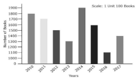
Example: 2) A bar graph depicting the number of books sold by a bookstore over several years is shown below.
Answer the following questions after reading the bar graph.
(1) What was the total number of books sold in 2010, 2011, and 2012?
(2) What year did 1300 books sell?
(3) Which year had the least number of books sold?
(4)In which year did the bookstore sell the most books?
Answers:
(1) In 2010, 1800 books were sold, 1700 books were sold in 2011, and 1500 books were sold in 2012.
(2) 1300 volumes were sold in 2013.
(3) In 2016, the fewest books were sold.
(4)Highest score of books sold by bookstore in 2014.
Conclusion
When comparing two or more data, or values across time, bar graphs are suitable. The information can be shown either horizontally or vertically. Single bar graphs display discrete values of a single item within a category. A bar graph, for example, may show the number of males with a given feature at various ages.