It is absolutely necessary to make use of diagrams for illustrating statistical data. Diagrammatic representations are by far the most effective means of conveying any kind of numerical information collected through statistical analysis. According to a well-known proverb, “a picture is worth a thousand words.” When compared to tabular or textual representations of the data, the diagrammatic display of the data offers a more instant comprehension of the real-world scenario that is being defined by the data.
It does this by effectively transforming the abstract and incredibly complicated notions that are contained in numbers into a format that is more concrete and easier to comprehend. When it comes to displaying data, diagrams are much more effective than tables, despite the fact that they are less certain. Diagrams come in a wide variety of forms and are used in a variety of contexts. In a similar vein, the diagrammatic depiction of data offers a wealth of insight into the numerical data.
Diagrammatic representations, such as cartographs, pictographs, Pie charts, bar diagrams, and so on, use geometrical figures as diagrams to better the data representation. Other examples of diagrammatic representations include
In the linear diagrammatic representations of the data, we will use the line that connects the points or portions of the various data in the graph by taking two variables on the horizontal and vertical axes. In other words, we will use the line that represents the relationship between the various data in the graph.
The data can be represented by rectangular bars when it is presented in a bar diagrammatic format. The value or frequency of the variable can be determined from the height of the bars. Each of the rectangular bars ought to have the same width. This is one of the most used tools for making comparisons between the data sets.
The data is depicted in histograms, which are also comparable to bar diagrams in that they employ rectangular bars. However, there is not even a single space between any of the rectangular bars.
A data set can be diagrammatically represented using circles and spheres in the form of a pie diagram. In pie diagrams, a circle is cut into sections, and each section represents a different fraction of the overall data set.
The data are displayed graphically in the pictographic representation, which may make use of images, symbols, or both. The symbol or picture that is utilised in the pictographic diagrams describes the frequency with which the object appears in the data that has been presented. The information about the data that was supplied was represented by symbols or pictures in pictographs.
A line graph is a sort of chart or graph that displays information by joining a series of data points together in the form of a line. It illustrates the shifts that have taken place in the data over a certain period of time. On a straight-line graph, we plot each different pair of values for (x, y). In this case, the x-axis indicates the various time points (t), and the y-axis indicates the observations made in accordance with the time.
It includes both vertical and horizontal scales in its make-up. These scales might or might not have a consistent measurement system.
Each data point represents a point in time and its corresponding change.
The direction of change can be inferred from the shape of the line that connects these data points.
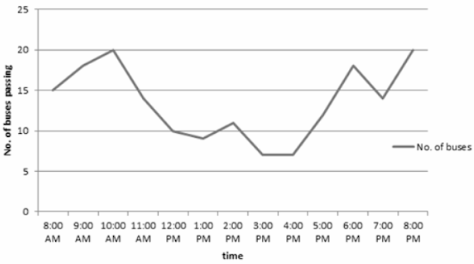
The following is a line graph that illustrates, during a specific period of time, the number of buses that travelled through a particular street:
The presentation of data using several kinds of diagrams offers a number of benefits that should not be overlooked. They constitute –
The display of data with the assistance of diagrams makes it simpler for everyone to understand, which in turn makes it simpler to comprehend the facts that lie behind the data that is being provided. Newspapers, periodicals, and even advertising campaigns will sometimes offer data in the form of diagrams to ensure that the general public is able to comprehend the information that the data is attempting to communicate.
The presentation of extreme values—both extended unstable data and small complicated data complex—can be simplified exponentially with the use of diagrams.
diagrams applied when representing datasets that need a comparison of their elements. Not only is the presentation appealing to the eye, but it is also perfectly suited for contrasting two sets of statistical data.
Diagrams are utilised in each and every academic and professional discipline across the globe, including but not limited to economics, commerce, science, engineering, statistics, and many more. As a result, this method of data presentation is widely recognised and utilised.
If diagrams and tables are not used to illustrate the data, then the statistics will be incomplete. As a result, the implementation of diagrams is beneficial to the overarching statistical idea of data representation.
Diagrams are an excellent way to express any kind of data, in addition to having an appealing appearance. The copious amounts of statistics that we produce can be simply represented through diagrams such as bar charts, pie charts, and so on. The presentation will appear to be cleaner and better organised as a result of this. They are not only incredibly simple to look at but also provide the reader with a visual aid that assists them in understanding the specific issue. They eliminate a great deal of wasted time and complication, in addition to providing a service that is indispensable. Every student needs to be taught how to properly portray data through the use of diagrams so that they may convey facts and numbers in an orderly fashion.
 Profile
 Settings
 Refer your friends
 Sign out