We use many types of graphs and diagrams in daily life. Bar graphs, histograms, pie charts, etc. Each graph represents data differently. While some are ideal for a particular data set, they may not be for another set. It is important to choose the right graph.
A scatter plot is another popular type of graph. A scatter plot – also known as a scatter diagram, scatter graph, scatter chart – is a type of graph used in mathematics and several other fields, such as management, psychology, market research, etc. This graph uses dots to represent values for two different variables and their relationship.
A scatter diagram illustrates the relationship between two numerical variables through dots. One variable (often the independent variable) is plotted on the x-axis, and the other variable (often the dependent variable) is plotted on the y-axis. Each data point is plotted across the corresponding axis.
This graph can help one understand how closely related the two variables are. The points at which the two variables intersect can also give interesting data. Furthermore, scatter diagrams are one of the seven quality tools utilised in root cause analysis.
There are certain places where scatter diagrams effectively represent your data. The three main uses have been given as follows:
Correlation between the data points can be identified based on how spread the points are. This degree of correlation is denoted by the symbol ‘r’.
When points are plotted close to each other, there is a high degree of correlation, i.e., they are closely related to one another. When the points are scattered all over the chart, the degree of correlation is low, i.e., they are very related.
The table below outlines the different correlation patterns identified in a scatter plot. These are also the types of scatter diagrams.
Correlation Pattern | X/Y Values |
Strong Positive Correlation | As the value of X increases, the value of Y increases. |
Weak Positive Correlation | As the value of X increases, the value of Y increases slightly. |
Strong Negative Correlation | As the value of X decreases, the value of Y decreases. |
Weak Negative Correlation | As the value of X decreases , the value of Y decreases slightly. |
No correlation | There is no relationship between the two variables. |
Complex Correlation | Although the value of X and Y are related to each other, and the relationship is not easily determined. |
A-Line of Best Fit can be used on a scatter diagram. This trend line helps identify any trends that may be taking place on the scatter plot. When the relationship between the two variables is strong, this line helps make that even more evident. Outlier points are also more easily identified with this trendline.
Let’s look at an example of a scatter diagram to better understand how they work.
Ice-cream shop XYZ keeps track of the number of ice creams they sell depending on the noon temperature of the day. Here’s what their raw data looks like for the past 10 days.
Ice Cream Sales vs Temperature | |
Temperature (C°) | Ice Cream Sales |
13.8° | $230 |
15.5° | $315 |
12.3° | $193 |
16.0° | $340 |
19.1° | $425 |
24.5° | $555 |
22.7° | $517 |
29.2° | $630 |
27.6° | $573 |
17.8° | $395 |
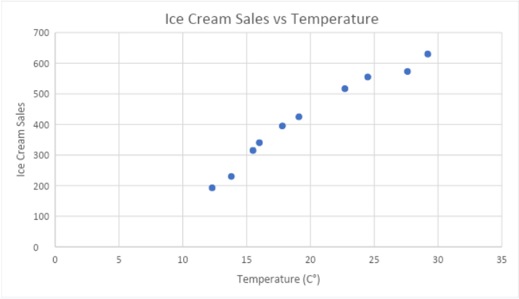
Now that we have the raw data before us, the next step is to plot this data onto a graph. The temperature will be plotted onto the x-axis, while ice cream sales will go on the y axis. This is because the temperature (the independent variable) is the one that affects the number of ice cream sales (the dependent variable) made in a day.
The scatter diagram for the above raw data is given below.
From the chart above, we can conclude that warmer temperatures lead to higher ice cream sales. The relationship is a strong positive correlation, but not a perfect one.
This is how the diagram would look with a trendline added.
Scatter diagrams are one of the most useful graphs for representing data graphically. They are used in various fields, from management to market research to psychology. No other graph is as effective at illustrating the relationship between two variables as scatter graphs are. Whether the relationship is a strong one, a weak one, positive, negative or none at all: scatter diagrams can help you easily identify it.


 Profile
 Settings
 Refer your friends
 Sign out