A line graph is a unique type of graph that is commonly used in statistics. It reflects a change in one quantity in relation to another. For example, the price of different chocolate flavours changes, which we can visualise using this graph. In most cases, this variation is shown in a two-dimensional XY plane. Linear graphs are those in which a relationship between any two metrics may be described using a straight line in a graph. As a result, a line graph is often known as a linear graph. Here, we’ll go over what a line graph is, the many types of line graphs, how to draw a line graph, and some examples.
A line chart is a graphical representation of data that is made up of points that are connected by a continuous line. Depending on the data being studied, the line can be straight or curved. Line charts are the most basic way of showing quantitative data between two variables with the use of a line that can be straight or curved. Because it provides a clear picture of the data, traders, investors, and financial officers use the line chart to depict the high and low in the market for a specific number. To represent data, a line chart uses a horizontal axis (x-axis) and a vertical axis (y-axis). The x-axis represents the time period, while the y-axis represents the item being measured. A line chart vividly displays an item’s increasing or declining trend. A line chart is created by connecting these data points with a line. A line graph is another name for a line chart.
Making a line graph is simple. Here are some easy steps to remember while making a line graph.
Reading a line graph is simple, and you can learn how to do so by reading the following points.
Then glance at the graph and look at the values of the points in the graph’s lines.
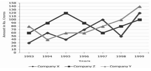
Examine the line graph below and respond to the questions.
Three Companies’ Exports Over the Years (in Rs. crore)
1)In which of the following year pairs do the three companies’ total exports equal each other?
2)What percent of Company Y’s average annual exports over the provided time is equal to Company Z’s average annual exports?
3)What year was the smallest difference in shipments between Companies X and Y?
4)What was the difference between the three firms’ average exports in 1993 and 1998?
5)How many of the aforementioned years did Company Z’s shipments exceed the average yearly exports of the given years?
To describe trends, use precise words such as steadily declining and a rapid spike. To make comparisons, use connecting expressions like while and in contrast. Only ‘Summarize the information,’ according to the query. Don’t include any explanations for why these trends have occurred, or your personal opinions on the subject.


 Profile
 Settings
 Refer your friends
 Sign out