Frequency polygons are essentially a graphical representation of the distribution of data which helps in properly understanding the given information through a particular shape. Histograms and frequency polygons are similar in many aspects. However, frequency polygons are more useful and helpful at the time of comparing between two sets of data.
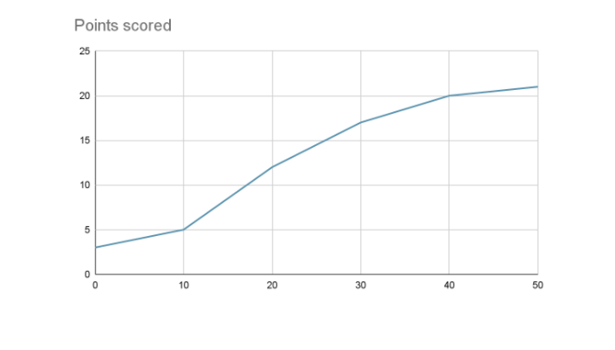
The definition of frequency polygon can be given as a type of graph that helps in interpreting data or information that is widely utilized in statistics. Hence, frequency polygon is a concept of statistics. The visual representation of the overall data set helps in the depiction of the trend and shape of the data in a systematic and organized manner. The visualization of a frequency polygon has been given in the following.
Fig 1: Frequency Polygon
The curve within a frequency polygon is specifically drawn on a y-axis and x-axis. Similar to a normal graph, the x-axis shows the values within the dataset whereas the y – axis shows the number of times each category has occurred. During the plotting of the frequency polygon, the most vital factor is the middle point which is known as the class marks or class interval. The curve of frequency polygon can be drawn without or with a histogram. While drawing it with a histogram, firstly rectangular bars are drawn against each classmark and then the middle points of the bars are joined to obtain the frequency polygon. The steps for drawing frequency polygon without a histogram have been outlined in the following.
In the 2nd step, the middle point for each class interval needs to be calculated whose formula can be given in the following manner. Class Mark (Middle Point) = (Lower Limit + Upper Limit) ÷ 2.
Example: Use the following data to construct a frequency polygon graph without a histogram.
Scores of test | Frequency |
49.5 to 59.5 | 3 |
59.5 to 69.5 | 2 |
69.5 to 79.5 | 2 |
79.5 to 89.5 | 3 |
89.5 to 99.5 | 5 |
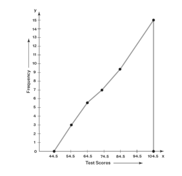
Answer: For constructing the frequency polygon graph without histogram firstly we need to calculate the classmark for each class through the use of the formula Classmark = (Lower Limit + Upper Limit) / 2. Also, we need to calculate the cumulative frequency for each class length by adding the next and previous frequency together.
Class interval = (49.5 + 59.5) / 2 = 54.5, (59.5 + 69.5) / 2 = 64.5, (69.5 + 79.5) / 2 = 74.5, (79.5 + 89.5) / 2 = 84.5 , (89.5 + 99.5)/2 = 94.5.
Test scores | Class Mark | Frequency | Cumulative frequency |
49.5 to 59.5 | 54.5 | 3 | 3 |
59.5 to 69.5 | 64.5 | 2 | 5 |
69.5 to 79.5 | 74.5 | 2 | 7 |
79.5 to 89.5 | 84.5 | 3 | 10 |
89.5 to 99.5 | 94.5 | 5 | 15 |
At the time of plotting the graph after and before the class, the mark is also marked. Here the after is 104.5 and the before is 44.5. The plotting of the scores is done on the x-axis and the plotting of the frequency is done on the y axis. The required frequency polygon has been outlined in the following.
Fig 2: Frequency polygon for the example
The article has been written on the statistical concept of Frequency polygon. It is essentially a graphical representation of the distribution of data which helps in properly understanding the given from information through a particular shape. In the article firstly the definition of frequency polygon has been provided. Next, discussions have been done on how to draw a frequency polygon and an example has been provided.


 Profile
 Settings
 Refer your friends
 Sign out